Forget those bland office cubicles—these local headquarters have been designed to blend the line between work and play, with lofty spaces, artistic walls and streams of natural light.
By Justine Amodeo
Stance
San Clemente
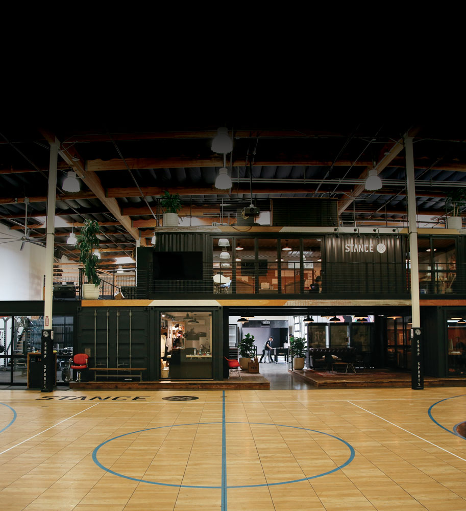
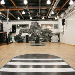
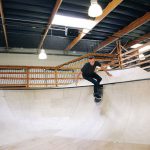
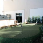
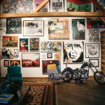
In a 22,000-square-foot container city built from stacked shipping containers, reclaimed wood, glass and steel, the Stance headquarters in San Clemente is full of open, lofty workspaces spread throughout the building on multiple levels, integrating private spaces with sliding glass doors for quieter work, cozy sitting areas that look like living rooms, as well as a skate bowl, weight room with personal trainer, full-size basketball court (appropriate considering the company’s multiyear partnership with the NBA) and a golf simulator. Natural light illuminates the industrial space through skylights that highlight original artwork created by Stance’s Punks & Poets artist partners, including Brian Bent, Kid Creature, Rose Ashton and Brooke
Reidt. The basketball court features a large wall spray-painted mural of a many-headed beast by Zio Ziegler.
“Art is a universal message, a universal language,” says Aaron Hennings, the company’s co-founder, chief brand officer and VP of creative. “It doesn’t have boundaries. There are no language constraints, which works well for a global brand.”
Product: Socks, Underwear
Designer: Stance VP of Creative Aaron Hennings
Architect: ITZEN
Inspiration: “People are dynamic,” says
Jeff Kearl, Stance’s former CEO and current chairman of the board. “So, the most
productive people probably eat really well—that’s why we serve super healthy breakfasts and lunches every day, to all the employees. We believe people are most efficient when they’re not sitting at a desk for eight straight hours. Maybe it’s two hours and then they take a break and go skateboard and come back.
We really believe that our people are much more productive in a shorter amount of time
at their keyboards.”
Urban Decay
Newport Beach
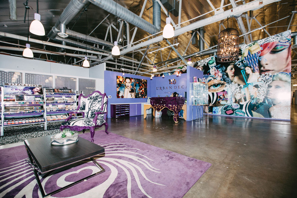
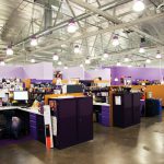
Urban Decay’s signature colors, purple and silver, are evident throughout the company’s corporate headquarters in Newport Beach, a massive warehouse with high walls splashed with bold hues of deep purple.
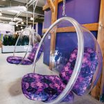
Shades of purple also cover the walls of the glam room, curtains, couches, rugs, powder-coated light fixtures, cubicle file cabinets, cafeteria chairs, product packaging, makeup containers and a basketball court with purple lines and a purple rim.
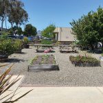
Two office buildings with tricked out bathrooms, a studio and an outdoor organic vegetable garden with raised beds designed by Harvest to Home make up the Urban Decay campus, where employees pick their lunch salads from the garden and fashionistas with bold lips and dramatic eye makeup bring their dogs to work (the line is cruelty free, meaning no animal testing), often lounging on nature-themed upholstered furniture.
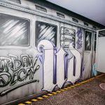
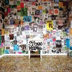
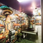
Then there are the bathrooms—design themes include a hunting lodge (mens), a subway station and “Alice in Wonderland” (a collaboration with Disney for the launch of Tim Burton’s “Alice in Wonderland” that put the company on the map in 2010). Walls set up as inspiration boards collaged with beauty ads, custom work stations made with formaldyhyde-free particle board and showpiece chandeliers in the conference rooms are just a few of the edgy details that reflect the beauty disruptor’s creative spirit.
Product: Cosmetics
Architect: Rick D’Amato at LPA
Inspiration: “The office was inspired by my old loft in Chicago, which was a big industrial creative space,” says Wende Zomnir, the company’s founding partner and chief creative officer. “We left the floors concrete to make it a dog-friendly workplace. It’s a creative space where our employees want to spend time and are inspired to do their best work.”
Happy Money
Tustin
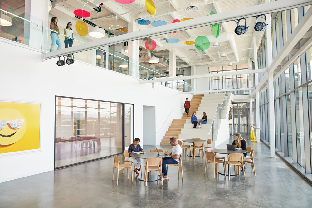
In 2019, Happy Money engaged Rapt Studio to solve their emerging workplace challenges brought on by rapid growth, inviting them to design a multilevel headquarters that embodied the fundamental principles of happiness. The bright Tustin office became the canvas on which Rapt translated Happy Money’s identity, with bold graphic murals inspired by the brand’s iconography and colors wrapped around walls and across corners and doorways, painted by design fabricators SPMD as well as Coco Nella, a woman-owned mural company in LA.
Custom art installations and curated framed prints inject bright hues, while the company’s altruistic manifesto is spelled out with raised lettering. Light streams into the first and second levels from glass garage doors that open up to balconies.
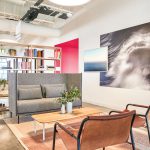
Placed between clusters of desks is reconfigurable furniture arranged in “huddle zones,” where teammates meet to hash out ideas, while enclosed “squad rooms” are bookable by teams for more structured collaboration.
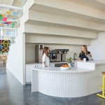
At the heart of the office is All Hands, with its wide bleacher stair bridging the first and second levels. As host to weekly “Happy [Money] Hours” and events like TED Talks that bring in visitors, it’s flanked by a cafe and serves as a social hub. A custom mobile fabricated by Powerhouse Sets is suspended above and catches the light with pink, blue, green, and yellow discs. Balancing midair, it’s a nod to the old money scales used in banking.
Product: Financial Services, Debt Reconstruction
Architect and Designer: Rapt Studio
Inspiration: According to Rapt Studio, Happy Money’s headquarters “exudes an optimism and cheerfulness that builds upon the company’s own data about happy experiences for employees and visitors alike. It serves as an extension of their brand, affirming the strength of the Happy Money Movement while reflecting and promoting who they are. No doubt it’ll become a powerful tool for these disruptors of a tired financial category who are changing the way we think about and use money.”

